
What Is a Customer Journey Map and How Venues Use It
Learn what is a customer journey map, the components that make it work, and how hospitality venues use it to trigger real guest journeys.
A quiet Tuesday can tell you more about your venue than a packed Saturday ever will. A guest walks in, joins the WiFi, orders at the counter, pays, leaves, and later ignores your review request. On paper, that looks like a normal visit. From the guest's side, it might have felt fast, anonymous, slightly rushed, and easy to forget.
That gap is where what is a customer journey map becomes practical, not theoretical. A good map shows the visit as the guest experiences it across channels and over time, including the touchpoints, emotions, friction, and backstage dependencies that shape whether they come back. It's not a list of what your team did that day. It's a model of what the guest lived through, from first discovery to retention.
Table of Contents
- A Quiet Tuesday That Tells You Everything
- What a Customer Journey Map Actually Is
- The Building Blocks That Make a Map Useful
- A Hospitality Journey Map From First Ad to Repeat Visit
- From Map to Data Model You Can Actually Trigger
- Triggering Real Journeys From the Map
- Making a Journey Map That Survives Contact With Reality
A Quiet Tuesday That Tells You Everything
A regular customer sits near the window, connects to the network, taps through the menu, and orders a coffee. Your till shows a sale, your router shows a sign-in, and your staff remember a polite exchange. None of those records, on their own, explain whether the guest felt recognised, overlooked, hurried, or ready to return.
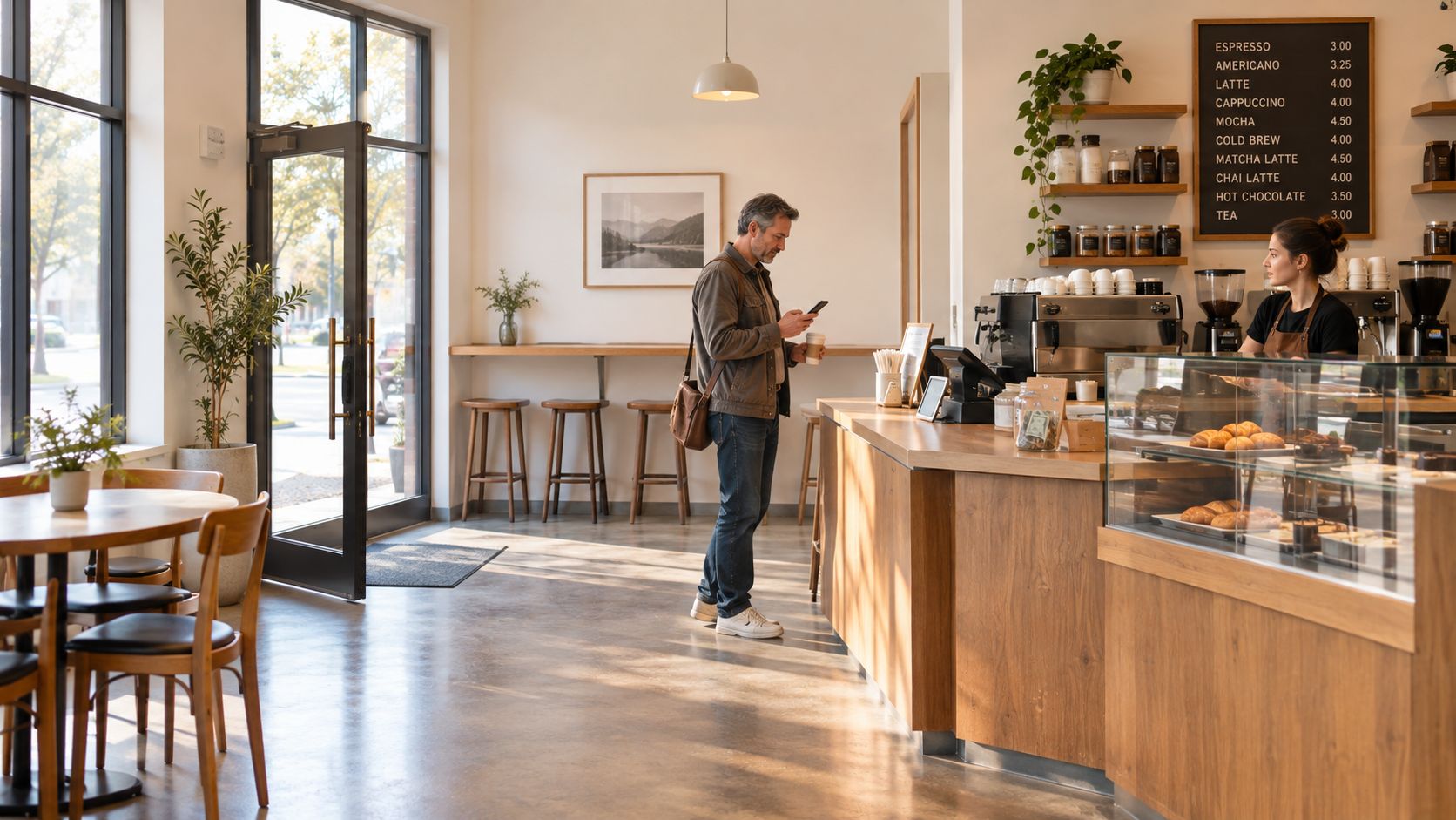
That's why venue operators need the guest's perspective, not just the operator's log of events. The customer journey map connects what happened before the visit, during the visit, and after the visit, so you can see where experience breaks and where loyalty is earned.
A journey map is useful when it helps you explain why a guest returned, not just that they returned.
For venue teams, this matters because the same visit can look smooth from operations and still feel fragmented to the customer. A coffee bar can have fast service, a clean counter, and a good product, yet still lose the next visit if the follow-up is awkward or the guest never feels known. The map closes that gap by stitching together the experience across channels, rather than pretending each touchpoint lives in isolation.
If you want a broader primer that connects mapping to physical locations, mapping station and venue experiences is a useful companion idea because it shows how location-based journeys depend on the actual path a person takes, not the internal org chart behind it.
What a Customer Journey Map Actually Is
A customer journey map is a chronological model of the touchpoints, actions, decisions, and perceptions a guest experiences while trying to reach a defined goal. That goal might be booking a table, ordering lunch, checking into a hotel, or coming back after a first visit. The key is that the map follows the customer's path, not the business's department structure.
The difference from tools people confuse it with
A contact list tells you who to contact. A campaign calendar tells you what you plan to send. A sales funnel tells you how many people move from one business stage to the next. A journey map does something different, it connects activity to the guest's experience and shows where friction appears between touchpoints.
That distinction matters because the guest doesn't experience your brand as a neat internal workflow. They experience it as a sequence of moments, some digital, some physical, some emotional, some invisible. A booking reminder, a queue at the host stand, a forgotten WiFi login, and a follow-up offer all belong to one story if they belong to one guest.
A strong map usually shows five layers:
- Stages, such as discovery, booking, visit, follow-up, and retention.
- Touchpoints, like ads, WiFi sign-in, till receipts, surveys, or review requests.
- Actions, meaning what the guest does at each point.
- Emotions, which reveal whether the moment felt easy, confusing, or rewarding.
- Backstage dependencies, such as staff hand-offs, systems, policies, or timing that shape the visible experience.
Why those layers matter together
If you only map stages, you get a timeline. If you add touchpoints, you get a channel view. If you add actions and emotions, you get customer reality. If you add backstage dependencies, you finally see why the experience sometimes fails even when the front of house looked fine.
Practical rule: if a diagram can't show where the guest felt friction, it isn't a journey map, it's decoration.
For operators who want a deeper service-design angle, the article on customer journey map basics and service design traces how the method grew from service blueprinting into a broader experience model. That history helps explain why modern maps combine customer actions with internal processes, not just marketing touchpoints.
The Building Blocks That Make a Map Useful
A map becomes useful when it has a person, a purpose, a timeline, and a way to describe experience. Without those, you can make a pretty wall graphic and still miss the part that matters most, why a specific guest moved forward or dropped off.
Persona and scenario give the map a real human shape
A persona is the guest you are mapping, not “all guests.” A scenario is the goal they're trying to achieve. A parent booking a family dinner behaves differently from a solo lunch regular, and a hotel guest checking in late has different needs from a local coming for a drink.
That's why the map should be scoped around one persona and one scenario at a time. If you try to cover everyone in one diagram, the result gets vague fast. The questions get weaker too. Instead of asking where a guest felt uncertain, you end up asking where “customers” might feel uncertain, which isn't useful enough to change behaviour.
Stages turn a vague timeline into a working structure
Stages give shape to the journey. In venue terms, that usually means pre-purchase, purchase, and post-purchase, though discovery and retention often need their own attention. The point isn't to force every guest into the same line, it's to give the team a shared sequence to discuss.
Good mapping is specific. It's easier to improve “guest joins WiFi before the booking” than “guest engagement.”
Experience variables show what the timeline alone can't
The second dimension is where a map starts to earn its keep. Emotion, effort, expectations, and pain points show whether a touchpoint is helping or hurting the journey. Backstage dependencies show why the problem exists, maybe a hand-off between host and server is slow, maybe the confirmation email lands late, maybe the offer is irrelevant.
Once those layers are present, the map stops being a poster and becomes a tool for asking better questions. Which step creates confusion? Which hand-off creates wait time? Which moment creates trust? Those are the questions that change repeat visits.
A Hospitality Journey Map From First Ad to Repeat Visit
A guest spots a paid social ad for a bar on a Tuesday afternoon. They tap through, land on the booking page, and reserve a table for Saturday. When they arrive, they join the WiFi, order drinks and food, and later receive a thank-you email with a short survey. A few weeks pass, the venue sends a no-visit-in-45-days offer, and the guest books again.
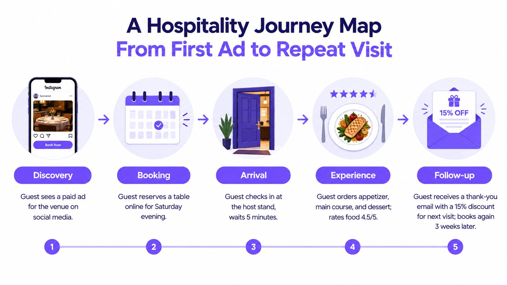
That's one map, not six separate campaigns. It covers discovery, consideration, booking, service use, post-visit communication, and retention in a single shared view. Marketing sees the ad and follow-up. Operations sees arrival and service. Tech sees WiFi, booking, and identity stitching. Finance can see whether the repeat visit is worth the effort.
For a practical venue example, try BonusQR for restaurants if you want to look at how restaurant-facing tools think about visits, offers, and return behaviour in the same operational flow.
What changes at each step
Discovery begins with the ad, where the guest notices the venue. Booking is the online reservation. Arrival is the host stand and the wait. Experience is the meal, the service, and the feeling the guest leaves with. Follow-up is the thank-you note, survey, or review request.
The useful part is not the sequence itself, it's the label on each step. A WiFi sign-in might be a low-friction touchpoint from the venue's side, but from the guest's side it can feel like a trade, a nuisance, or a shortcut to guest WiFi access. A post-visit email might feel thoughtful or generic depending on timing and relevance.
If you want to see how a hospitality team can structure the first contact after a visit, the welcome email series for first-time guests is a useful companion pattern.
When a venue operator maps the full journey this way, they stop treating the guest as a lead in one system and a diner in another. They start seeing one person moving through one experience.
From Map to Data Model You Can Actually Trigger
A poster can describe the journey. A data model can record it. That difference is the reason so many journey maps look good in workshops and then disappear when the team tries to use them for automation, measurement, or operational change.
Poster thinking and live records solve different problems
A static map is a hypothesis. It says, “This is probably how the guest moves through the experience.” That's valuable, but it's not enough to trigger work. A journey data model records real events across channels, so the venue can act on actual behaviour rather than assumptions.
That matters because journeys aren't always linear. Guests can discover a venue on social media, visit anonymously, come back through a booking channel, and later respond to email or WhatsApp without following a clean funnel. They can move in loops, switch devices, and cross from anonymous to known identity in the middle of the relationship.
| Dimension | Customer Journey Map | Journey Data Model |
|---|---|---|
| Purpose | Communicates hypotheses and friction | Records variable behaviour and triggers action |
| Shape | Often simplified and visual | Event-based and cross-channel |
| Best use | Alignment, discovery, planning | Automation, measurement, and identity matching |
| Weakness | Can become outdated or assumptive | Needs governance and clean data rules |
The difference is simple. The map is for thinking. The data model is for triggering work.
Where venue systems need to connect
A useful data model can pull in WiFi sign-ins, bookings, tills, stays, forms, surveys, and review requests, then join those events to one guest record. That's what lets a venue see that a guest signed in, booked, visited, ignored a follow-up, and later came back after a timed offer. Without that connective layer, each system only sees its own fragment of the story.
For venue operators exploring this kind of setup, first-party data for venues is a relevant lens because it connects identity, consent, and usable audience data in one place.
The difference shows up in edge cases. A poster can't show a guest who never booked. It can't show someone who visited twice under different identities. It can't show the third-party influence of a review site, a booking platform, or a staff reminder at the table. A live model can.
Triggering Real Journeys From the Map
A guest signs into venue WiFi at lunchtime, then gets a welcome message that feels timely because it matches the moment. A completed booking can send a confirmation, a purchase can trigger a receipt and survey, a checkout can start a review request, and a quiet period can start a win-back journey. Platforms like Purple Engage build these journeys directly on top of the events your map defines.
The trigger should match the moment
Broad messaging after every event creates noise. A booking confirmation serves a different job from a post-visit email, and a win-back offer only belongs in front of guests who have gone quiet.
Consent and approval controls sit inside the same workflow. A single consent ledger needs to be checked before contact goes out, and opt-outs must stay in place even when data arrives from elsewhere. Human approval keeps the team accountable for the relationship, even when a system drafts the copy.
Operational rule: if the guest did not consent to the channel, the journey stops there.
Measurement has to prove uplift, not just activity
Opens and clicks show attention, but they do not show whether a journey caused a booking, a purchase, or a repeat visit. A holdout group compares guests who received the journey with similar guests who did not, which isolates the incremental effect that open and click rates cannot show.
That keeps the map honest in day-to-day use. If a win-back sequence reaches lapsed guests and some of them return, the team still needs to know whether those visits were caused by the journey or would have happened anyway. If the control group behaves differently, the journey has changed something meaningful.
Purple Engage is one option in this space because it combines journeys, unified guest records, consent checks, and holdout-based measurement in one venue marketing platform. The value is the approved workflow, measured against a control group, so the map becomes something the team can operate rather than just display.
Making a Journey Map That Survives Contact With Reality
A colourful map on a wall is easy to admire and easy to ignore. The version that survives is owned, refreshed, measured, and tied to action. That matters because only 47% of surveyed organizations had a customer journey map, and the missing pieces often included purchase pathways by segment, satisfaction, repeat-purchase behaviour, consent boundaries, and accountability Hanover Research.
What makes a map durable
The first requirement is ownership. Someone has to maintain the map, decide when it gets refreshed, and resolve mismatches between systems. The second is identity-matching rules, because a guest who appears in WiFi, POS, and email needs to be treated as one record where appropriate. The third is controlled experimentation, because you need to know whether a journey changed outcomes or just happened before them.
Privacy belongs in the same conversation. Consent boundaries, approval rules, and direct data use are part of map quality, not side issues. If the venue can't explain where the data came from, what the guest agreed to, and how the message was approved, the map is too fragile to use operationally.
What to stop doing
Stop treating the journey map as a one-time workshop output. Stop using open rates as proof of conversion. Stop assuming that because a guest received an offer before returning, the offer caused the return. That sequence might be true and still be misleading.
The better habit is a short operational checklist, owned by a real team, with a live refresh cadence and a measurement method that compares against a held-back group. That's the difference between a neat diagram and a working customer system.
If you want to turn guest journeys into something your venue team can trigger, measure, and govern, take a look at Purple Engage. It brings WiFi sign-ins, bookings, receipts, surveys, and stays into one guest record, then uses approved journeys and holdout measurement to show what really drives repeat visits.